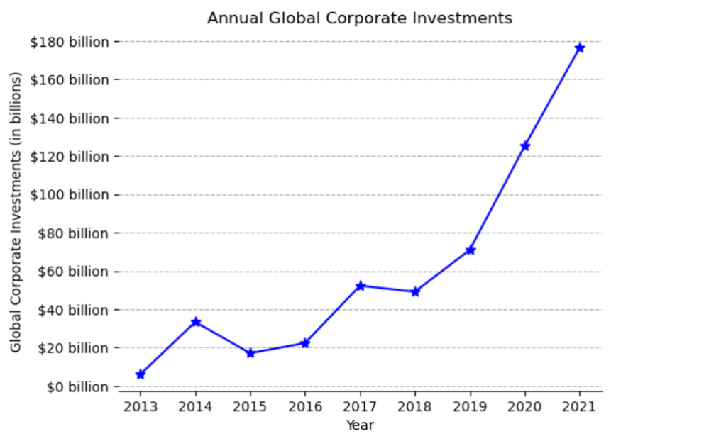
Bu problemde, yapay olarak yıllık küresel kurumsal yatırımlar için bir grafik üretildi.
“corporate-investment-in-yapay-intelligence-total.csv” dosyasında verilen veriler kullanıldı.
import matplotlib.pyplot as plt
import pandas as pd
import numpy as np
#Load csv file into x, y co-ordinates
investment = pd.read_csv('corporate-investment-in-artificial-intelligence-total.csv', delimiter=',')
# Create plot
fig, ax = plt.subplots()
x = investment['Year']
y = investment['total_corporate_investment_inflation_adjusted']
ax.plot(x, y, marker="*", markersize=8, color='blue')

# Set the y-tick labels to be separated by 20 billion dollars
y_ticks = np.array([0, 20, 40, 60, 80, 100, 120, 140, 160, 180]) * 1e9
y_ticklabels = ['$' + str(int(tick/1e9)) + ' billion' for tick in y_ticks]
ax.set_yticks(y_ticks)
ax.set_yticklabels(y_ticklabels)

# Remove spines
ax.spines['right'].set_visible(False)
ax.spines['left'].set_visible(False)
ax.spines['top'].set_visible(False)

# Add grid lines for y-axis
ax.yaxis.grid(linestyle='--')

# Add labels and title
ax.set_xlabel('Year')
ax.set_ylabel('Global Corporate Investments (in billions)')
ax.set_title('Annual Global Corporate Investments')

# Display plot
plt.show()
output :
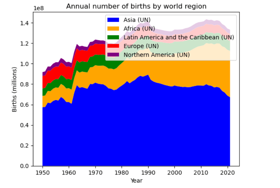
Bu problemde doğum sayısını içeren "dünya-bölgeye göre-yıllık-doğum sayısı.csv" dosyası verilir.Bu dosyada her ülke ve bölge için doğum sayısı yer almaktadır . Aşağıda verilen ülkelerin doğum sayıları grafikle gösterilecektirç
Aşağıdaki bölgeler seçilmelidir.
Afrika (BM)
Asya (BM)
Avrupa (BM)
Latin Amerika ve Karayipler (BM)
Kuzey Amerika (BM)
import pandas as pd
import matplotlib.pyplot as plt

df = pd.read_csv('annual-number-of-births-by-world-region.csv')

europe = df[df['Entity'] == 'Europe (UN)']
asia = df[df['Entity'] == 'Asia (UN)']
north_america = df[df['Entity'] == 'Northern America (UN)']
latin_america = df[df['Entity'] == 'Latin America and the Caribbean (UN)']
africa = df[df['Entity'] == 'Africa (UN)']

years = europe['Year']
births_europe = europe['Births - Sex: all - Age: all - Variant: estimates']
births_asia = asia['Births - Sex: all - Age: all - Variant: estimates']
births_north_america = north_america['Births - Sex: all - Age: all - Variant: estimates']
births_latin_america = latin_america['Births - Sex: all - Age: all - Variant: estimates']
births_africa = africa['Births - Sex: all - Age: all - Variant: estimates']

colors = ['blue', 'orange', 'green', 'red', 'purple']
labels = ['Asia (UN) ', 'Africa (UN)', 'Latin America and the Caribbean (UN)', 'Europe (UN)', 'Northern America (UN)']

plt.stackplot(years, births_asia, births_africa, births_latin_america, births_europe, births_north_america,
              labels=labels, colors=colors)
# Set the y-tick labels to be separated by 20 million
y_ticks = np.array([0, 20, 40, 60, 80, 100, 120, 140]) * 1e8
y_ticklabels = [str(int(tick/1e8)) + ' million' for tick in y_ticks]
ax.set_yticks(y_ticks)
ax.set_yticklabels(y_ticklabels)

plt.xlabel('Year')
plt.ylabel('Births (millions)')
plt.title('Annual number of births by world region')
plt.legend(loc='upper right')
plt.show()
output :